
AllGrow App
How I optimized user experience and data presentation to streamline administrative tasks and improve educational engagement.
All Grow App: Admin Dashboard for Education Management
The Challenge: Making Admin Work Easier
When I first approached this project, I knew I was stepping into the world of education management—a space where efficiency is everything. Imagine an admin juggling hundreds of students, teachers, and mentors, all while trying to track progress, send out newsletters, and manage content. The existing process? A patchwork of emails, Google Sheets, and manual tracking—scattered, time-consuming, and prone to errors.
An exciting opportunity where I took on the dual role of UX researcher and designer, driving user-centered design solutions and contributing to the overall growth of All Grow’s digital presence.
GOALS:
Simplify how admins manage users (students, teachers, mentors)
Create a seamless way to track student progress & engagement
Make newsletter & content management effortless
Improve navigation so admins don’t waste time looking for basic actions
But before I could design anything, I needed to understand what wasn’t working.
Understanding the Users: What Was Missing?
I started with conversations—talking to stakeholders, admins, and educators to get a feel for their pain points. They shared frustrations about:
Struggling to find students & teachers—“There’s no easy way to filter or search for users.”
Tracking student progress felt like a guessing game—“We can’t see who’s engaged, who’s falling behind, or who needs support.”
The newsletter system was confusing—“We need an easy way to create and distribute updates.”
To validate these challenges, I ran competitive research, looking at how similar platforms handled admin workflows. I mapped out a sitemap & information architecture to ensure the new structure made sense.
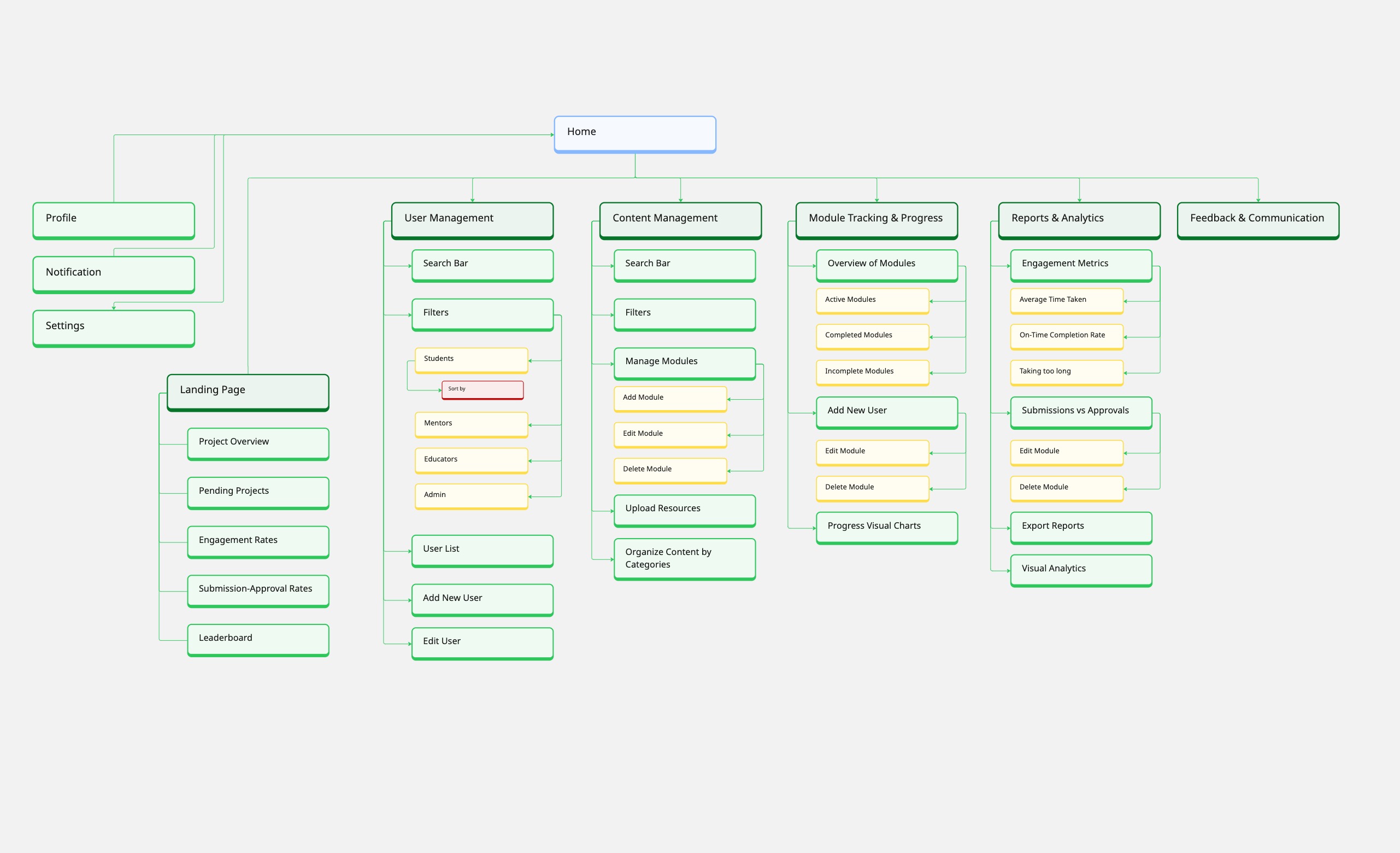
Sitemaps & Information Architecture
To design an intuitive experience, I first structured the information architecture, ensuring admins could easily navigate between different sections.
Sitemap Overview
Information Architecture Breakdown
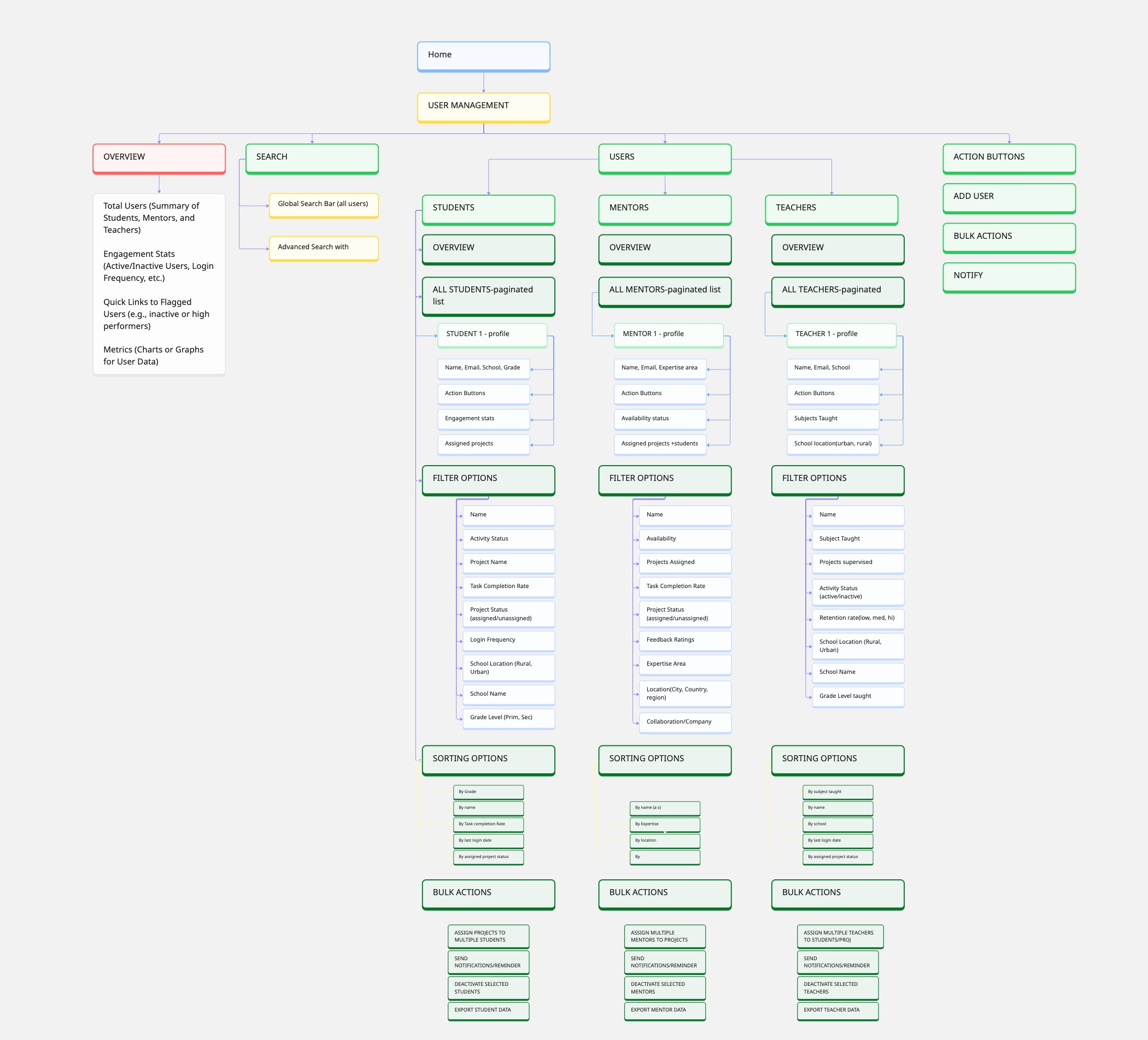
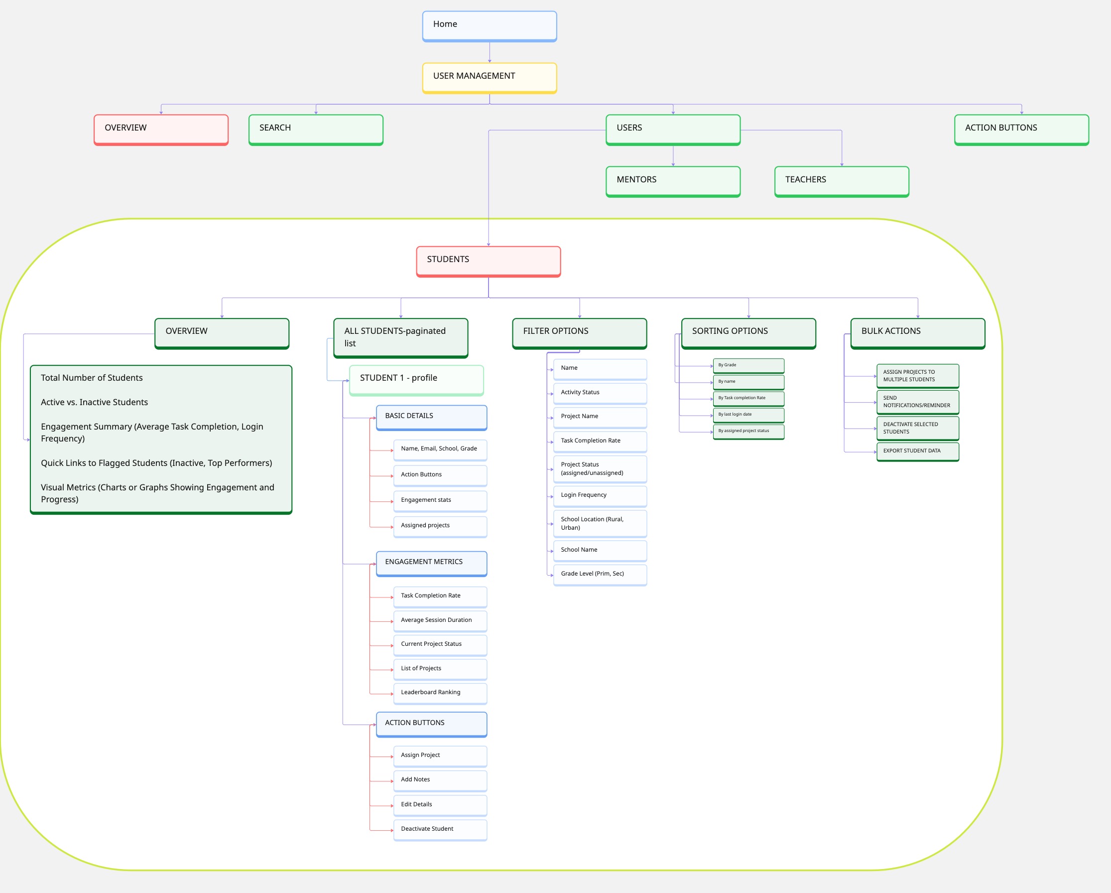
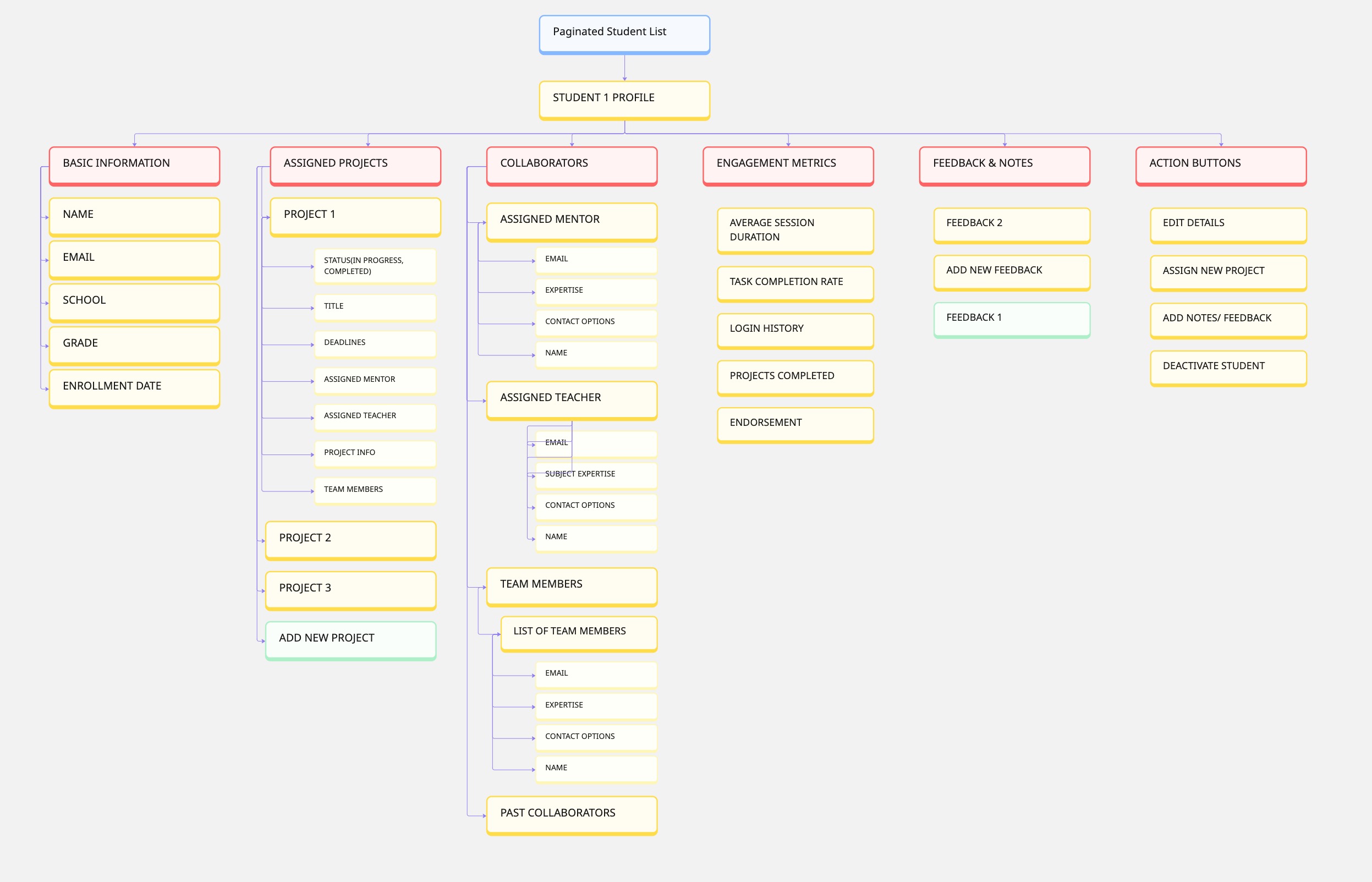
This helped ensure that users could move effortlessly between tasks without confusion.
📌 Breaking It Down: How I Designed the Solution
I took the core problems and translated them into structured, focused design solutions:
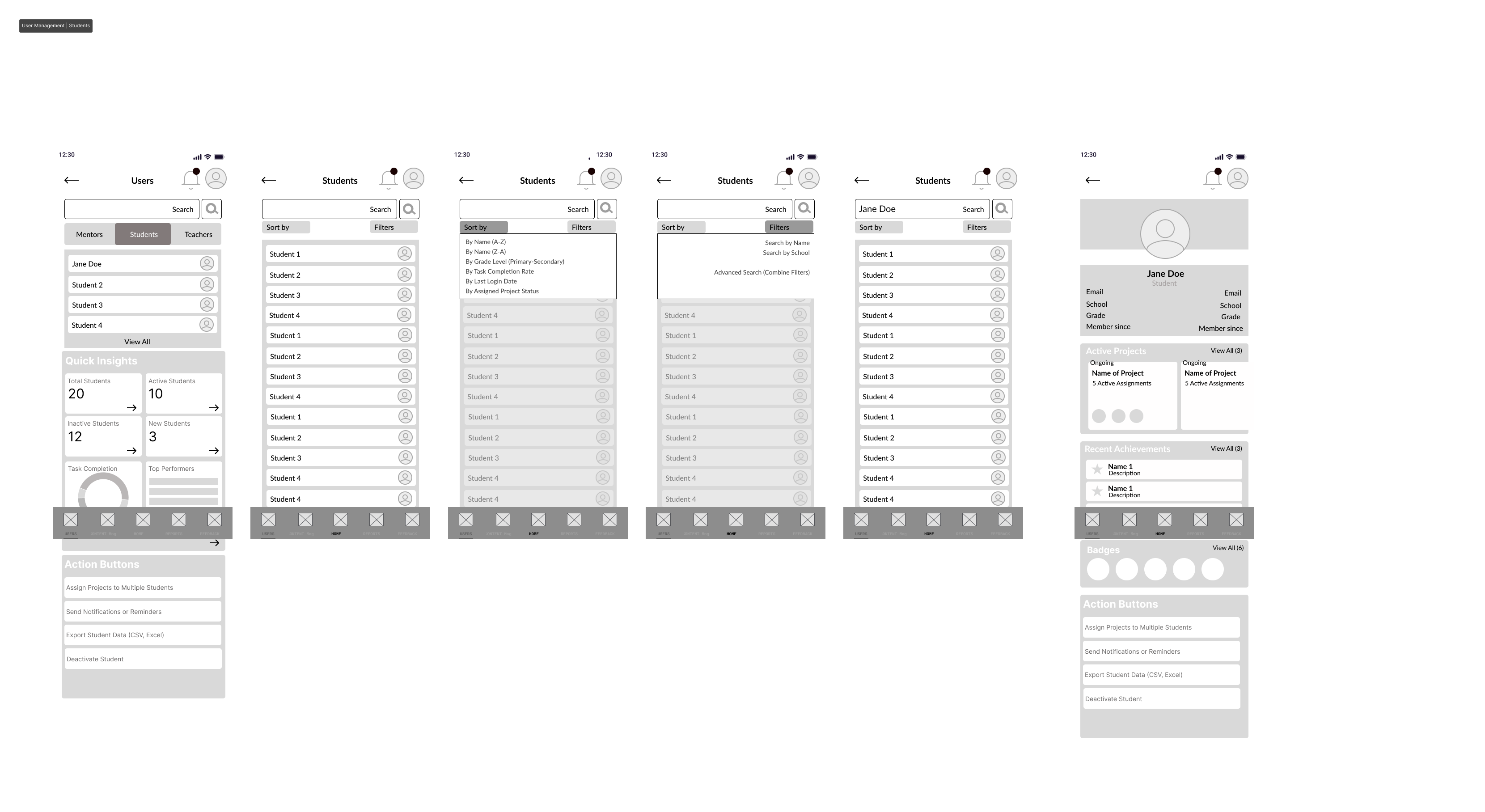
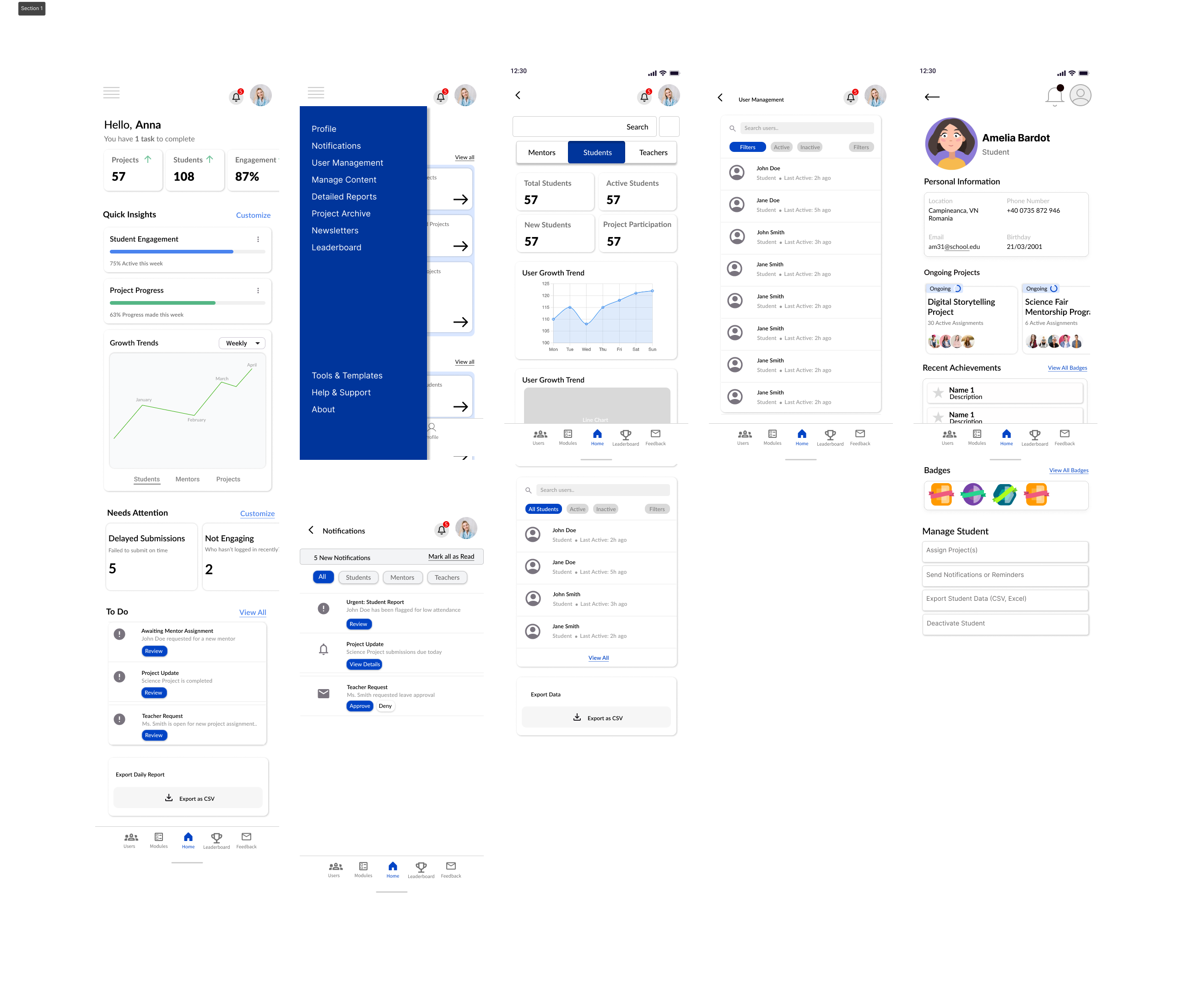
User Management – Finding the Right People, Fast
Problem: Admins had no quick way to filter & search for students, teachers, and mentors.
💡 Solution: I designed an interactive filtering system with search, sorting, and status indicators (Active, Inactive, Needs Attention).
Module Tracking & Progress – Making Engagement Visible
Problem: Admins couldn't see who was progressing and who was struggling.
💡 Solution: I introduced a progress tracking dashboard with:
Completion rates (who's finishing projects?)
Engagement stats (logins, time spent on modules)
Automated flags for at-risk students
Newsletters – No More Confusing Content Management
Problem: The newsletter feature was hard to find & use.
💡 Solution: I redesigned the workflow so that newsletters were in one dedicated section, with a clear action button to create a new one.
Now, admins wouldn’t have to dig through menus just to send an update.
Designing the Experience: Wireframing & Prototyping
With the structure and user flows finalized, I moved into wireframing.
Low-Fidelity Wireframes (Initial Design Concepts)
High-Fidelity Prototypes (Finalized UI & Interactions)
I ran an unmoderated user test on UserTesting.com, where admins were given tasks like:
“Find a student named Amelia Bardot.”
“Create a new newsletter.”
From these tests, I gathered interaction data, refined the designs, and improved usability.
Research & Usability Testing Findings
No design is perfect on the first try, so I turned to real users for feedback.
Key Takeaways from User Testing:
Admins expected search & filters to be more prominent → I adjusted the UI to make them more intuitive.
Finding the newsletter feature wasn’t instant → I redesigned the section with clearer labels.
Leaderboard filters needed refinement → I introduced sorting by grade level, project type, and mentor recommendation.
These findings helped shape the final prototype, ensuring admins could navigate the dashboard efficiently.
Final Takeaways & Next Steps
This project taught me that a well-designed admin experience is about more than just UI—it’s about workflow, logic, and efficiency.
Now, the Admin Dashboard is a tool that actually helps:
Admins can find users instantly
Tracking student progress is effortless
Creating newsletters is no longer a hassle
Navigation is seamless & intuitive
Looking ahead, I’d love to explore automated reports, better mentor-student matching, and predictive engagement tracking—so admins don’t just react to problems, but prevent them.
📍 Want to See the Full Prototype?
🔗 Click Here
This case study represents how I approach UX strategy, research, and interaction design—focusing on real user needs, efficient workflows, and data-driven improvements. 🚀