Naer VR
How I transformed usability flaws in the mixed reality environment to ensure seamless interaction for every user.
Deliverables: User Interview, Journey maps, Sketches, Wireframes, Mid-Fi & HiFi Prototypes, Research Synthesis
Teammates: Buvana Sundar, Tanisha Shah Role:
Rotated roles as PM, UX Researcher, and UX Designer every two weeks to foster versatility and comprehensive project insights.
The Problem
• Naer VR app aims to boost productivity and teamwork, but faces notable accessibility and usability challenges.
• Tool icons blend into the environment, hindering visibility for visually impaired users; access via hand gestures is inconsistent.
• Sticky notes tool relies solely on voice typing, restricting inclusivity; only sticky notes and spray cans are available.
• Limited customization options; error correction and exit processes are cumbersome and time-consuming.
Goals
• UI/UX for enhanced usability and visual appeal.
• Implement high-contrast icons and a user-friendly toolbar.
• Broaden editing tools with font, size, and content options.
• Add audio-visual feedback for a more intuitive experience.
• Introduce more interactive features within the environment.
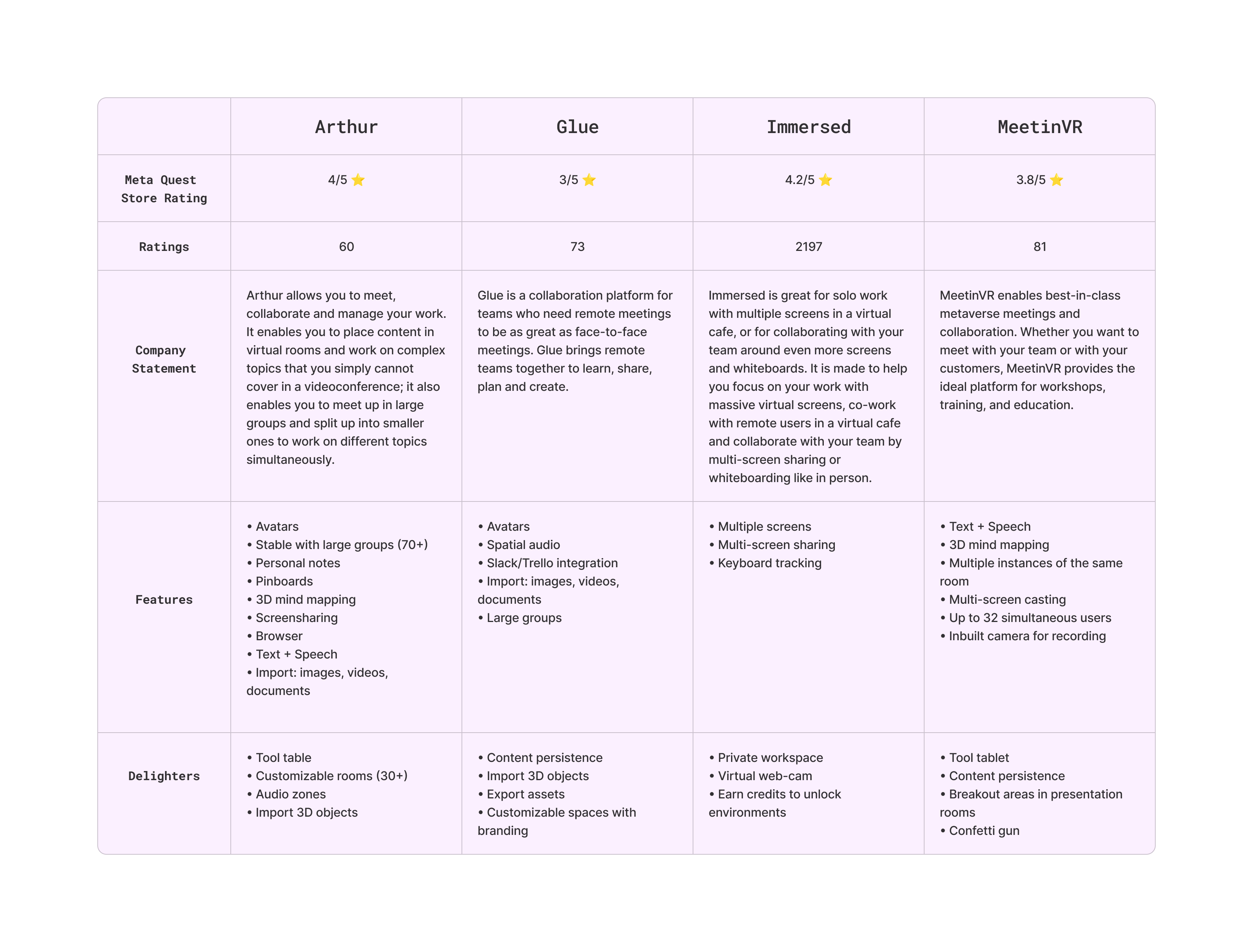
Competitive Analysis
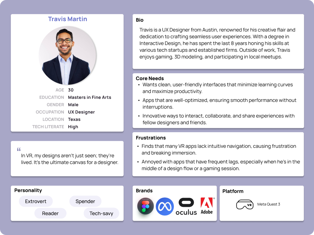
Proto Persona
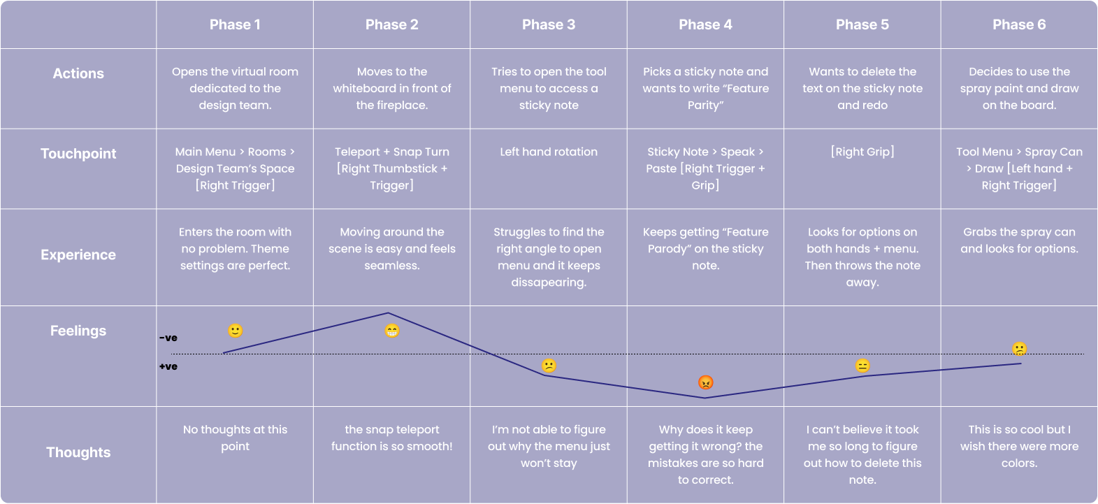
User Journey
Information Architecture

LoFi Wireframes


Research Goals
Understand User Needs in VR
Users’ goals, pain points, and preferences for productivity and teamwork in VR, and how Naer compares to existing tools like Miro, for users with different levels of familiarity with VR and remote working.
Assess Naer’s Role
We aimed to explore how users incorporate Naer into their design workflows & identify what specific needs it fulfills within their virtual environments.
Test Proposed Solutions
We sought to evaluate the proposed design solutions and new features, gathering feedback on their feasibility and their impact on enhancing user satisfaction and overall experience.
Evaluate Tool Efficiency
This involved investigating how effectively users can operate the existing tools within Naer — visibility & distinguishability of tool icons, limitations of the voice typing input, etc.
Explore the Function of Interactive Elements
Question users about their perceptions of Naer’s interactive ‘cubes’ to determine their value. Additionally, explore the potential for adding more interactive elements.
Usability Testing
To observe firsthand how users navigate Nær app, identify pain points and gather insights on possible improvements. Gain insights on possible design solutions presented in lo-fi wireframes.
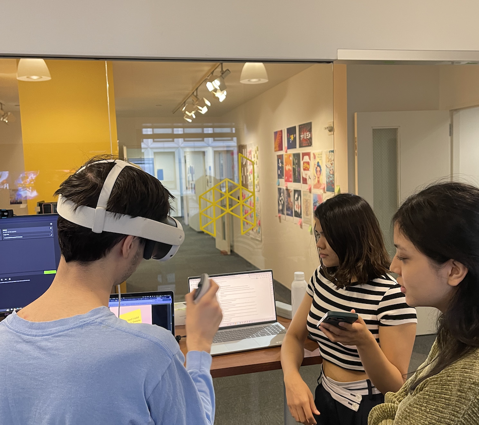
A comprehensive usability test that spanned from initial tutorial interactions to free-form exploration. This moderated session was crucial in assessing how real users interact with the app and identifying areas for improvement.
Focused Areas of Inquiry
◦ Accessibility and Visual Clarity
◦ Inclusivity and Input Methods
◦ General User Experience
After our participants were done exploring the app, we showed them our lofi design solutions on paper. Through observation and targeted questions, we gained valuable insights into the user experience, including the intuitiveness of new icons and the effectiveness of potential accessibility enhancements. This feedback was pivotal for shaping the actionable recommendations we’ll now discuss in our synthesis.
Insights
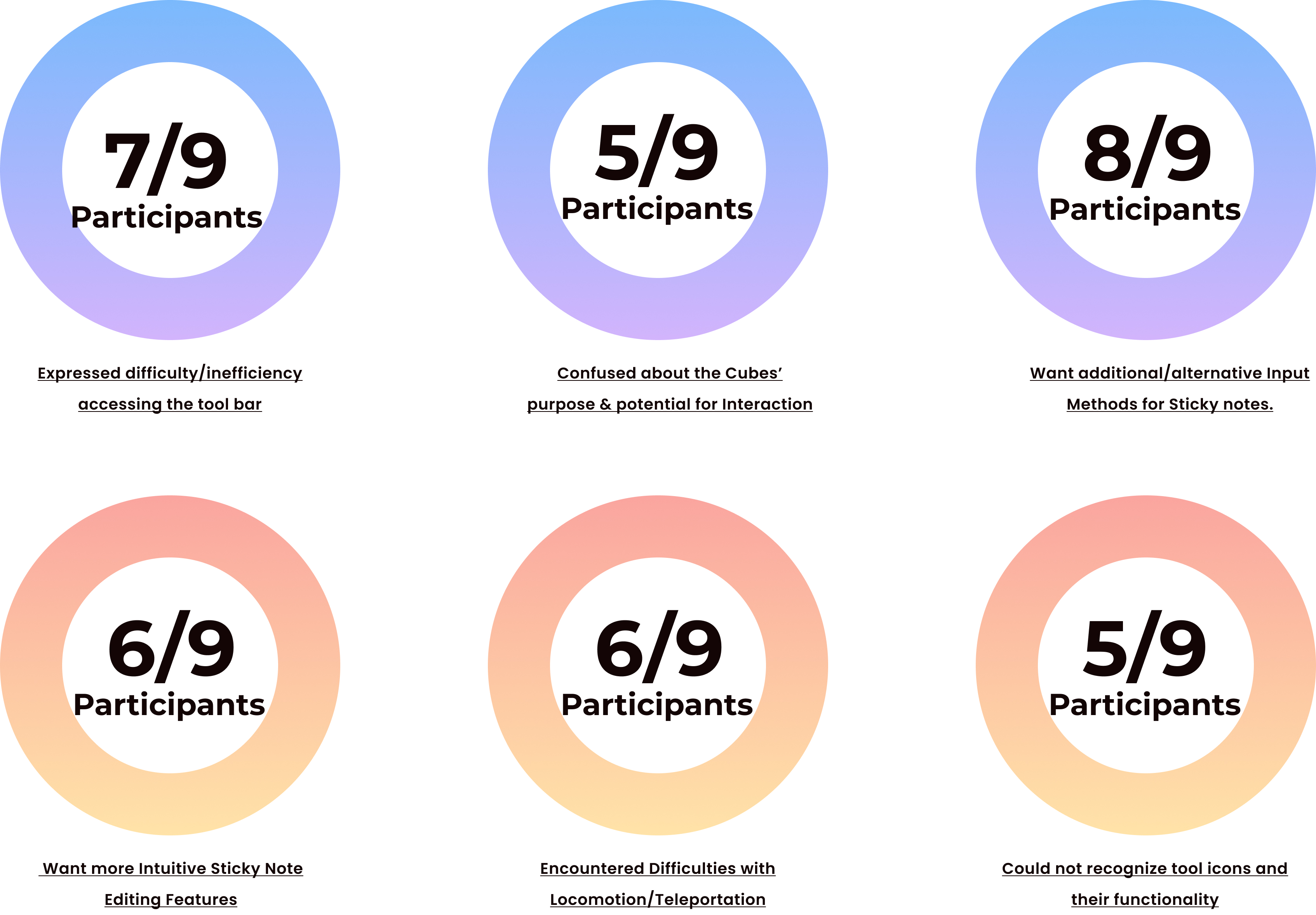
Findings

Effort-Impact Matrix

◦ Improve Iconography, Expand Customization/ Personalization Options
◦ Clarify Interactive Elements and their Purpose
◦ Enhance Input Method including keyboard typing and controller gestures.
◦ Simplify Navigation within the Virtual Environment.
◦ Streamline Text Editing by Adding Features such as undo, redo, and erase to the sticky notes function.
◦ Increase the contrast and size of text and icons for better visibility.
Naer Toolbar
Following our rigorous testings, we identified the above mentioned critical areas needing enhancement and brainstormed potential solutions to improve the overall user experience.
This is when our team decided to divide the work.I took on the responsibility of redesigning the toolbar, focusing on enhancing its visibility and developing a more intuitive method of accessing it.
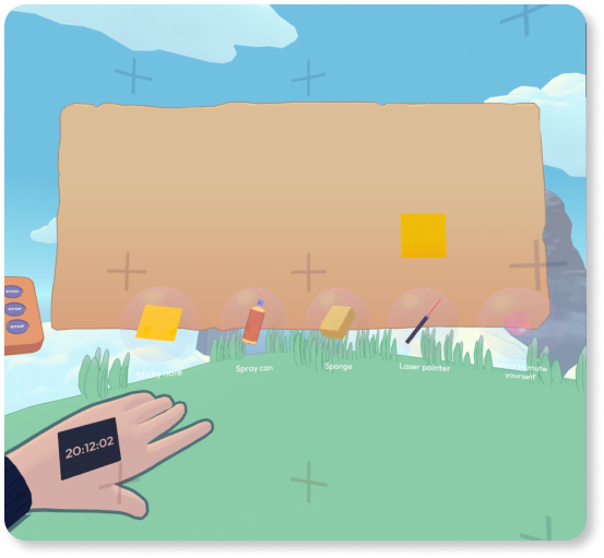
Addressing the Toolbar Issue
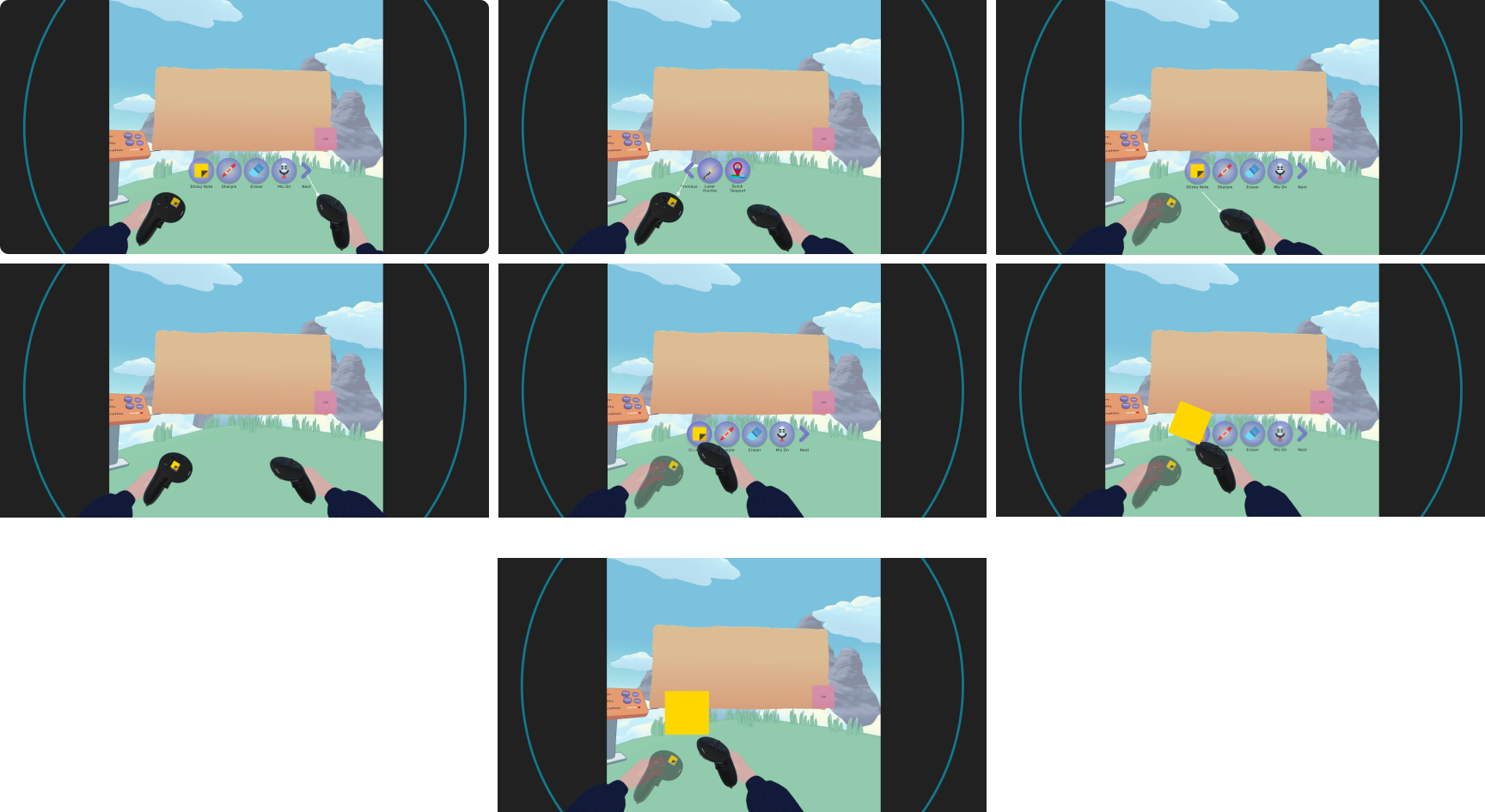
The toolbar is a central feature of the Naer App, hosting essential tools such as the Sticky Note, Sponge, Laser Pointer, and Microphone. However, several issues have compromised its effectiveness and user experience.
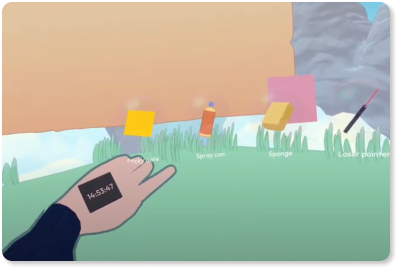
•The contrast between the toolbar and the virtual environment is notably poor, causing the toolbar icons and their labels to nearly blend into the background. Lack of visibility and poor readability can hinder user interaction and productivity within the app.
• The current design requires users to look at the back of their hands to activate the toolbar, which many found non-intuitive. Additionally, because the toolbar is anchored to the user’s view, it disappears with certain head movements, disrupting the workflow and causing frustration.
• These issues highlight the need for a more accessible and user-friendly toolbar design that remains consistently visible and is easier to access, enhancing the overall user experience in the virtual space.
My Design Solution for Toolbar

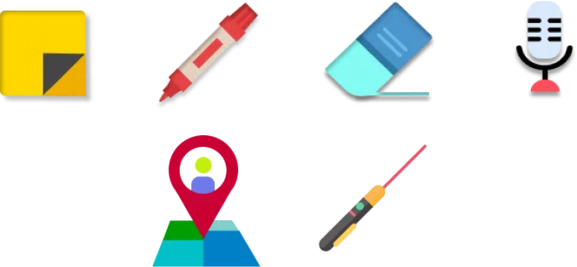
◦ Replacing the hand-based activation, I’ve designed a tactile wristband that users can simply tap to bring up the toolbar. This ensures the toolbar remains accessible without obstructive head movements.
◦ To combat the issue of icons blending into the environment, I’ve increased the opacity and introduced a contrast-rich color scheme.
◦ Moving away from icons that weren’t self-explanatory, I’ve created a set of new, intuitive symbols, each carefully crafted to be instantly recognizable, minimizing user confusion and learning time.
Mid-Fi Wireframes
Usability Testing II
Creating an Interactive Prototype
After finalizing the wireframes, I moved to the next crucial step: building an interactive prototype. To achieve this, I utilized Glitch, an online platform that enables rapid prototyping and sharing of web applications. For the VR environment, I employed A-Frame, a web framework that simplifies the creation of VR experiences. This combination allowed me to quickly iterate on the design and functionality, bringing the wireframes to life in an immersive 3D space.

Testing the Prototype in Virtual Reality
With the prototype ready, the next phase was to test it in a VR environment. This step was vital to understand how real users would interact with the new toolbar and identify any areas for improvement.

Recommendations
Based on the feedback, I formulated several actionable recommendations:
◦ Enhance Icon Distinctiveness: Redesign less recognizable icons to ensure they are easily identifiable.
◦ Improve Interactive Feedback: Increase the visibility of selection feedback to avoid any confusion about which tool is active.
◦ Standardize Hover Effects: Ensure hover effects are uniformly applied to all tools for a consistent user experience.
If you’re interested in exploring the previous research findings, you can find them here.
Closing Note
This research phase has been instrumental in refining the VR toolbar. The insights gained from real user interactions are invaluable, guiding further enhancements to ensure the toolbar is not only functional but also intuitive. We are committed to continuously improving our designs based on user feedback and look forward to seeing how these changes enhance the overall user experience in the Naer VR app.

